What if the most expensive mistake in your home renovation isn't the furniture, but the four walls surrounding it? A 2023 home trends report found that 62% of UK property owners feel dissatisfied with their decor because colors look different under local light than they did in the showroom. It's time to be inspired by a more sophisticated approach. You want your living space to be the interior of your dreams, reflecting your personal success through every carefully chosen shade.
We understand the difficulty of matching paint to bespoke cabinetry or the fear of choosing a trend that dates too quickly. You deserve a cohesive strategy that feels both timeless and unique. This article provides designer-curated elegant interior color palettes and expert guidance to transform your Coventry or Solihull home into a bespoke masterpiece. We'll show you how to master lighting in traditional homes, gain confidence in high-end finishes, and create a sanctuary that truly represents your taste.
Key Takeaways
- Discover the secrets of sophisticated design by mastering the delicate balance of depth and light within your living spaces.
- Explore a curated selection of elegant interior color palettes for 2026, designed to evoke a sense of timeless luxury and creative freedom.
- Learn how to navigate the unique lighting of West Midlands properties to ensure your chosen shades remain vibrant and true throughout the day.
- See how bespoke wardrobes and custom cabinetry act as the perfect anchor for a cohesive and beautifully integrated room scheme.
- It’s time to be inspired by the transformative power of professional guidance, turning your personal vision into a bespoke masterpiece.
Defining Elegance: What Makes a Sophisticated Interior Palette?
Elegance is an intentional choice. It's the art of restraint. When you select elegant interior color palettes, you're choosing longevity over fleeting fads. Sophistication thrives on balance. It's found in the way natural light interacts with a matte finish at dusk. True elegance doesn't shout for attention; it commands it through quiet confidence and a focus on depth rather than high-saturation trends.
Your journey toward a more refined home begins with understanding how elegant interior color palettes transform a floor plan into a sanctuary. This process relies on "bridge colours." These are the subtle, transitional shades that connect a dining room to a hallway. They ensure your home feels like a single, cohesive narrative rather than a collection of disjointed rooms. By applying color theory principles, you can create a seamless flow that guides the eye naturally from one space to the next.
In the West Midlands property market, a well-executed palette is a significant financial asset. A 2022 report by the HomeOwners Alliance suggests that high-quality interior presentation can influence a buyer's decision within the first 30 seconds of a viewing. A sophisticated palette can increase the perceived value of a property by up to 10% by highlighting architectural quality and spatial volume.
The Psychology of Sophisticated Tones
Sophistication is often found in "visual silence." This concept uses muted earth tones and deep charcoals to reduce mental clutter. It's about creating a backdrop that allows your life to take centre stage. Bespoke interiors rely on these neutral foundations for several reasons:
- Calm Confidence: Muted tones lower the heart rate and evoke a sense of stability.
- Highlighting Craftsmanship: Neutral walls act as a gallery space for high-end joinery and fine fabrics.
- Versatility: A sophisticated base allows for seasonal accents without requiring a full redesign.
West Midlands Architectural Context
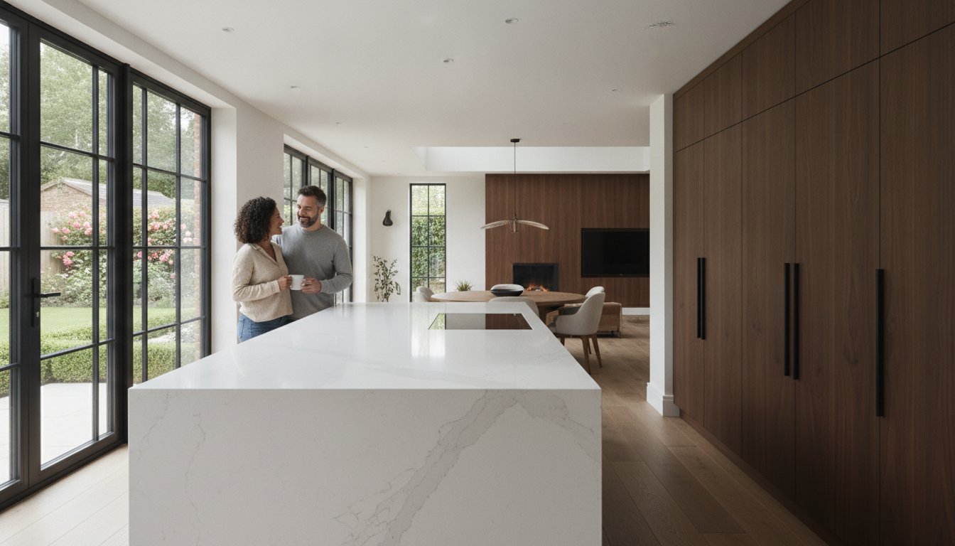
The West Midlands offers a diverse architectural landscape that demands a tailored approach to colour. Victorian homes in Leamington Spa often feature 3-meter ceilings and intricate cornicing. These spaces require palettes with high pigment density to handle the vast wall area without looking washed out. Deep teals or stone greys can ground these large rooms while respecting their heritage.
Contrast this with the modern builds found in Solihull. These homes frequently feature expansive glass and open-plan layouts. Here, the challenge is different. You need a palette that provides warmth to balance the cool light from large windows. Using soft ochres or warm sands helps to bridge the gap between the sleek, contemporary architecture and a lived-in, welcoming atmosphere. It's about respecting the original features of your home while introducing a fresh, personal colour story.
5 Elegant Interior Color Palettes for 2026
The aesthetic landscape of 2026 focuses on "quiet luxury" and emotional resonance. Selecting the right tones transforms a house into a sanctuary of personal expression. It’s about more than just paint; it’s about crafting the perfect palette that reflects your unique story and influences the mood of every room. Designers are currently seeing a 45% increase in requests for palettes that prioritise longevity over fleeting trends.
The Heirloom Neutral: Timeless and Grounded
This palette relies on soft ochres, aged parchment, and deep walnut accents. It’s a masterful choice for spaces featuring custom furniture design. To prevent a neutral room from feeling cold, use warm whites with subtle yellow or pink undertones. These shades react beautifully with natural light. Pair these tones with natural wood grains and stone textures, such as tumbled travertine, to create a layered, tactile environment that feels established rather than new.
The Modern Manor: A Fresh Take on Tradition
Suburban Birmingham homes are seeing a rise in the "Modern Manor" aesthetic. This look is ideal for luxury living room design. Slate blue and misty grey create a sophisticated, cool-toned backdrop that feels expansive. The secret to this palette lies in the "third colour." Brushed brass or gold hardware provides the essential warmth needed to balance the cool slate. It’s a look that feels both historic and contemporary, perfect for 2026’s refined tastes.
The Organic Sanctuary: Nature-Inspired Calm
Sage green and warm terracotta dominate this palette, creating a restorative environment. Bleached oak elements add a light, airy feel that grounds the more colourful earthy tones. This combination brings the outdoors in, fostering a sense of peace that’s increasingly sought after in busy West Midlands households. A 2024 survey of interior designers noted that biophilic-inspired palettes now account for nearly 30% of high-end residential projects.
The Midnight Velvet: Dramatic Sophistication
For those who embrace bold choices, Midnight Velvet uses ink blue, charcoal, and silver-toned textiles. It’s an exceptional choice for dining rooms or private studies. The dark hues create an intimate, cocoon-like atmosphere. Silver accents or metallic threads in the upholstery reflect light, ensuring the space remains elegant and never feels overly dark or enclosed.
The Champagne Suite: Master Bedroom Elegance
The Champagne Suite is the pinnacle of master bedroom design. It utilises cream, taupe, and subtle metallic finishes to create a restorative retreat. This palette relies on a variety of textures—silk, velvet, and high-thread-count cotton—to add depth without introducing jarring colours. It’s a sophisticated approach that ensures the most personal room in the house remains a place of absolute calm.
Your vision is the starting point for every design journey. If you’re ready to see how these elegant interior color palettes look in a real-world setting, explore our gallery for more inspiration.
The Science of Colour: Lighting and Texture in UK Homes
Selecting a shade in a bright showroom is only the beginning of your design journey. That soft taupe might look radiant under industrial spotlights, yet it often shifts to a cold lilac once applied to a wall in a Coventry semi-detached home. This happens because light is never neutral. To master elegant interior color palettes, you must understand how your specific environment interacts with pigment. Your home is a canvas where the sky and the streetscape act as filters.
The 60-30-10 rule provides a reliable framework for achieving balance in any room. It's a simple ratio that ensures your vision remains sophisticated:
- 60% Dominant Colour: Usually your walls or largest rugs.
- 30% Secondary Colour: Upholstery, curtains, or accent furniture.
- 10% Accent Colour: Cushions, artwork, and decorative accessories.
The finish you choose also dictates the final result. A matt finish absorbs light, hiding wall imperfections and offering a deep, velvety look. Silk or satin finishes reflect light. These can make a small, dark room feel larger, but they also highlight every minor bump in your plasterwork.
Navigating the British Light
The West Midlands often experiences overcast conditions. Met Office data shows the UK averages fewer than 1,500 sunshine hours annually; this means our interiors live in diffused, cool light for much of the year. North-facing rooms receive the least direct sun and often feel chilly. To keep these spaces warm, opt for elegant interior color palettes with yellow or red undertones rather than cool greys.
Test your samples at 10:00 AM, 1:00 PM, and 4:00 PM. The shifting sun changes the visible spectrum of the paint significantly. During the long winter months, artificial lighting becomes your primary light source. Use bulbs with a colour temperature of 2700K to 3000K. This warm light mimics the golden hour and prevents your palette from feeling clinical or harsh.
Layering Textures for Depth
A flat colour palette often feels two-dimensional and lacks the "wow" factor of a professionally designed space. Texture is the secret to bringing your dream interior to life. Velvet cushions or wool throws don't just provide comfort; they change how a colour is perceived by creating highlights and shadows within the fabric. A navy blue velvet sofa looks much richer than a flat navy cotton one because of how the pile catches the light.
Small details make a massive impact on the overall atmosphere. You can learn how to style a coffee table to introduce these necessary accent colours through books, trays, or ceramics. Natural materials like oak, marble, or brass ground a scheme and provide a tactile connection to the space. It's time to be inspired by the possibilities that a well-layered room offers. Your vision is unique; let the textures tell your story.
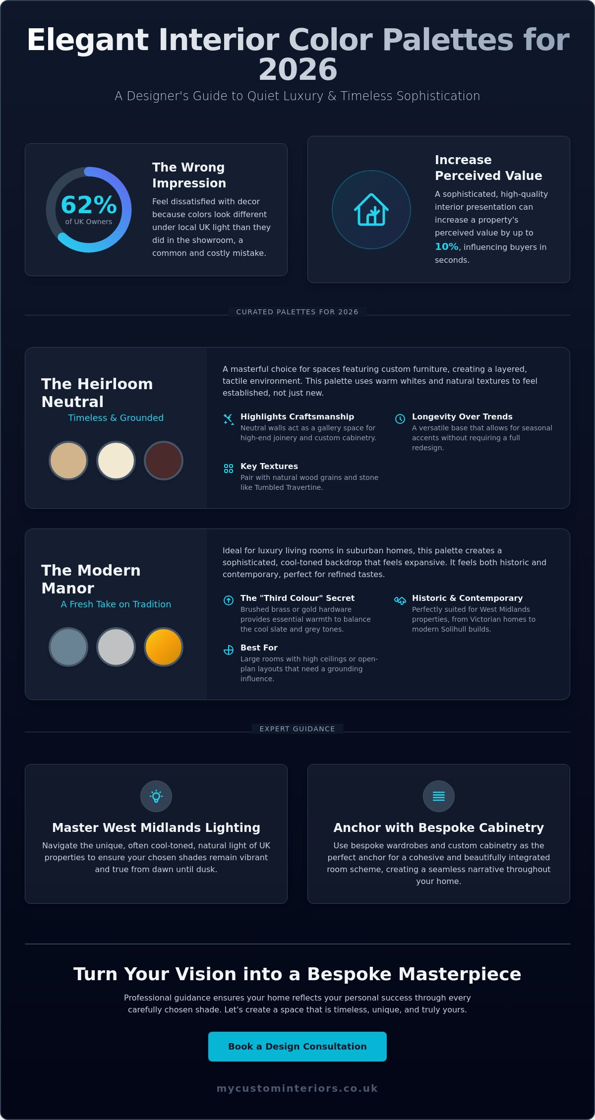
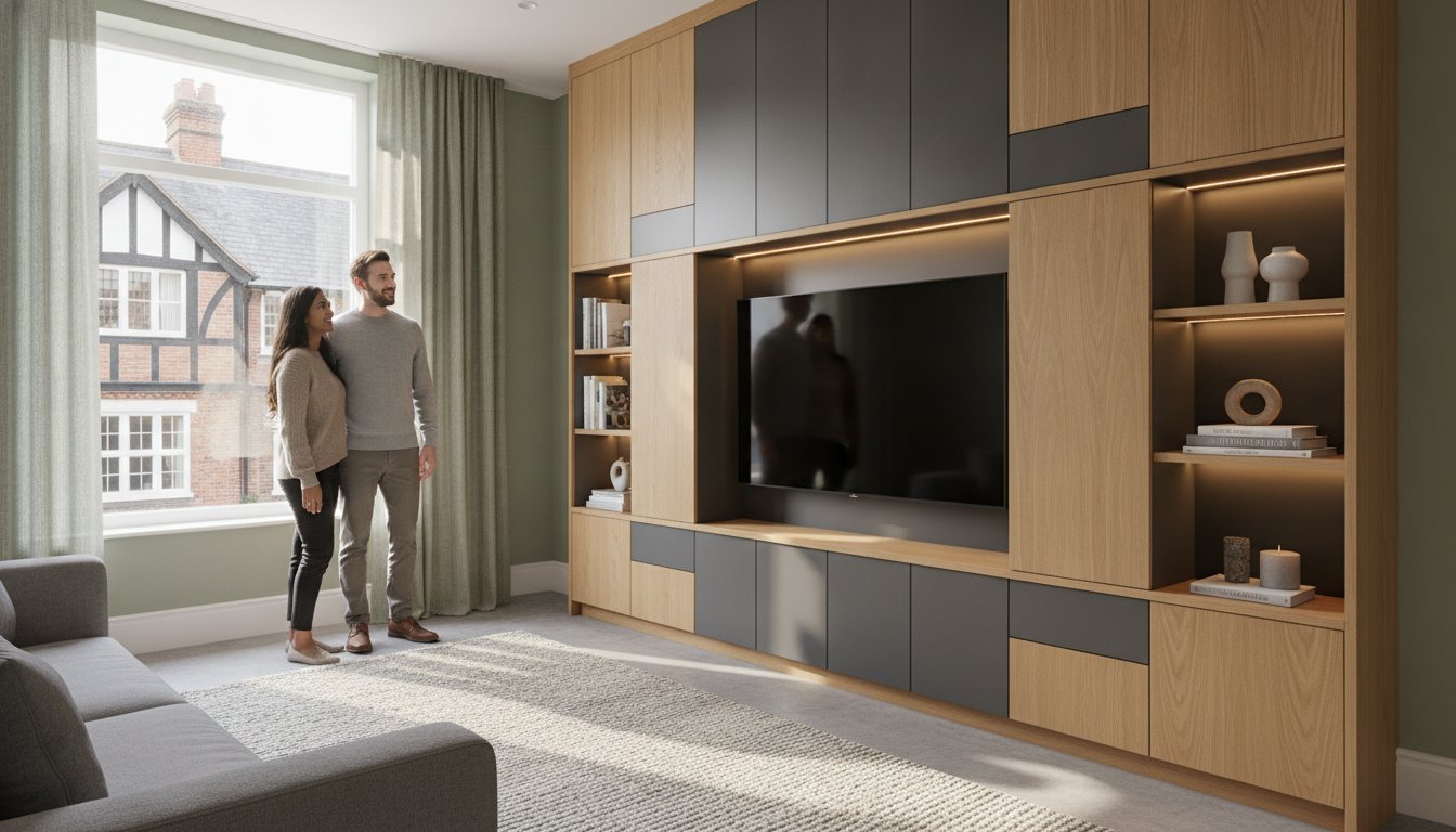
Harmonising Palettes with Bespoke Cabinetry and Wardrobes
Custom furniture acts as the anchor for your room. It provides the visual weight necessary to ground elegant interior color palettes. When you invest in bespoke cabinetry, you aren't just buying storage; you're selecting the primary texture and tone that dictates how light behaves in your space. A hand-painted dresser or a floor-to-ceiling media unit becomes the focal point that ties disparate decor elements together. Integrated design ensures that your furniture and wall colours are planned as a single, cohesive unit rather than separate afterthoughts.
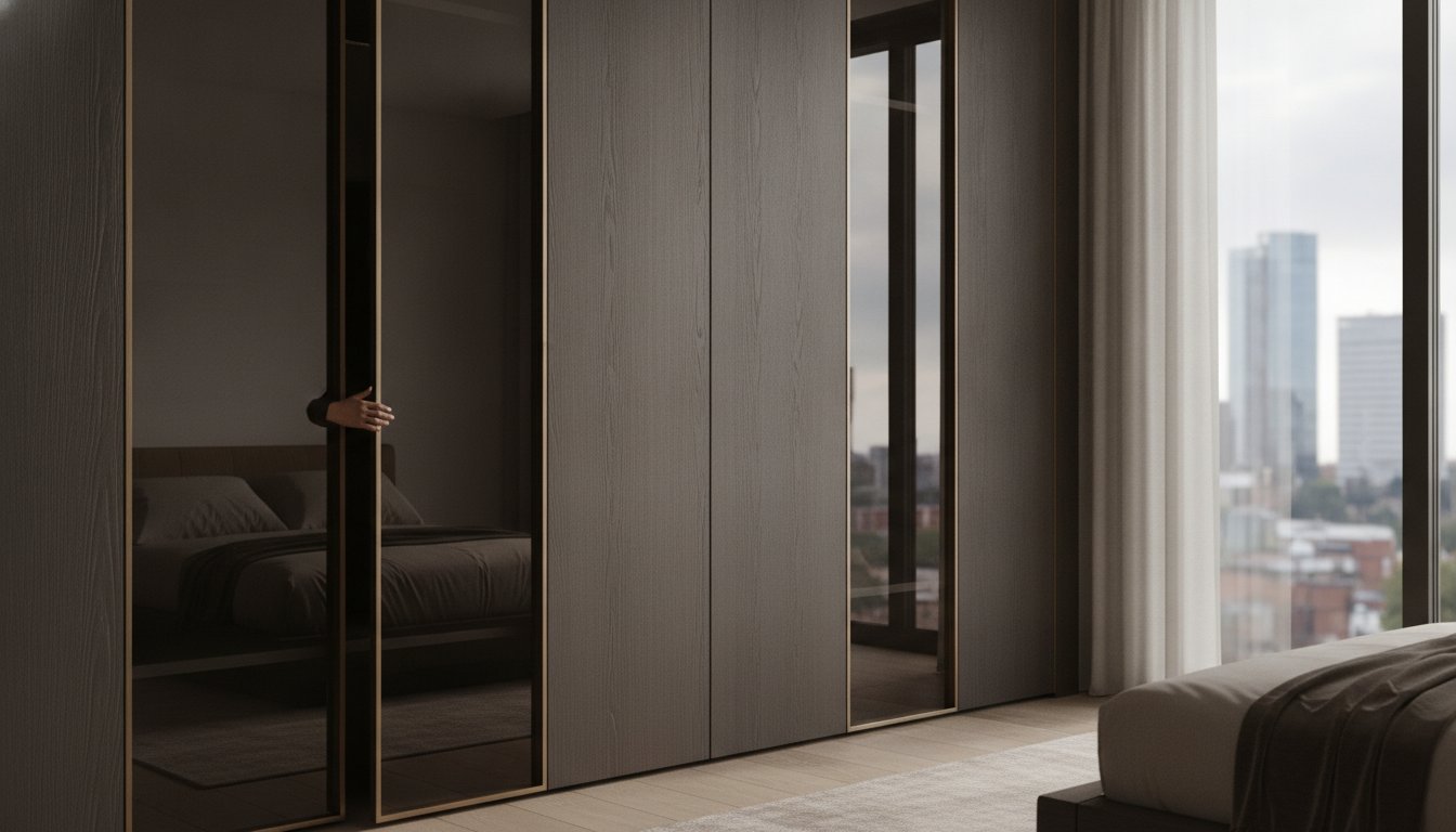
The Seamless Wardrobe Integration
A large sliding wardrobe can dominate a bedroom. To create a sense of calm, use tonal matching. This technique involves painting your wardrobe doors in the exact shade as your walls, or a half-strength version of the same pigment. This makes the structure "disappear" into the architecture, which is a hallmark of sophisticated West Midlands renovations. If you prefer a statement, choose a contrasting finish like deep navy against a pale grey wall. Materials play a vital role here. A natural Walnut finish contains warm orange undertones that can make cool blue walls feel chilly, while light Oak reflects 15% more natural light than darker hardwoods, brightening smaller dressing rooms.
From Inspiration to Bespoke Reality
Moving from a mood board to a finished room requires a structured approach. Understanding the luxury interior design process helps homeowners bridge the gap between a vague colour idea and a tangible result. Professional designers use light-reflectance values (LRV) to ensure your cabinetry doesn't look different under LED spotlights than it did in the showroom.
Bespoke cabinetry offers a more nuanced colour approach than flat-pack options. While mass-produced furniture often limits you to five or six standard finishes, bespoke services allow for exact colour matching to any premium paint brand. This precision is essential when coordinating kitchen islands with stone worktops. For example, a Calacatta marble with grey veining pairs perfectly with a Charcoal island, creating the high-contrast look that defined 2023 luxury trends.
- Integrated lighting highlights the depth of custom paint finishes.
- Bespoke commissions allow for "colour drenching" where furniture and trim match perfectly.
- High-quality lacquers provide a durability that standard emulsions can't match.
It's time to be inspired by the potential of your own home. You can start your journey toward a perfectly coordinated home by choosing to explore our bespoke design services today.
Bringing Your Vision to Life in the West Midlands
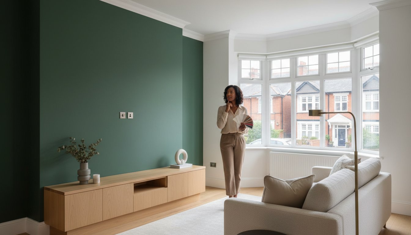
Selecting elegant interior color palettes is the first step toward a sophisticated home, but the transition from a digital image to a physical room requires precision. While a Pinterest board captures a mood, it doesn't account for the way northern light hits a lounge in Solihull or how a Warwick townhouse's high ceilings swallow darker tones. My Custom Interiors bridges this gap. We transform your initial sparks of inspiration into a tangible, bespoke reality that functions for your daily life.
A professional design consultation is essential for complex palettes. We analyze the architectural bones of your property to ensure that chosen shades harmonize with your existing features. This process eliminates the guesswork that leads to expensive mistakes. Our experts focus on the subtle undertones of every pigment, ensuring your home feels cohesive rather than cluttered. We don't just suggest colors; we curate an atmosphere tailored to your specific aspirations.
Local Expertise for Your Dream Home
Our deep roots in the West Midlands allow us to understand the unique character of local properties. From the historic charm of Warwick to the modern developments in Birmingham city centre, we've spent years refining our craft. We've completed over 200 bespoke projects across Coventry and Solihull, providing us with the technical insight needed to handle diverse home styles. Our commitment to quality means we manage every detail of the process.
- Precision Measurement: We use advanced tools to ensure every custom element fits your space perfectly.
- Technical Installation: Our team handles the heavy lifting, from initial prep to the final reveal.
- Bespoke Quality: Every finish is selected to meet high standards of durability and aesthetics.
- Local Knowledge: We understand the specific lighting and structural challenges common in West Midlands architecture.
It’s Time to Be Inspired
Your home is the most personal project you'll ever undertake. It's time to be inspired by the potential of your own space and move beyond generic designs. Trusting your personal vision with a professional partner allows you to explore a thousand new possibilities. We're here to provide the steady hand and creative eye needed to bring the interior of your dreams to life. You don't have to settle for "standard" when bespoke excellence is within reach.
The journey to a more sophisticated home begins with a single conversation. We invite you to explore our gallery of completed West Midlands projects to see the level of detail we bring to every room. Once you're ready to take the next step, you can book a local visit with our design team. Let's work together to create a home that reflects your style and enhances your lifestyle. Contact us today to schedule your bespoke consultation and start your transformation.
Realise Your Aspirational Home Vision
Creating a sophisticated space starts with understanding how elegant interior color palettes interact with the unique light found in UK homes. You've explored how the 2026 design trends prioritise depth and texture; moving beyond simple neutrals to embrace rich, intentional tones. These palettes gain true character when paired with high-quality finishes and bespoke sliding wardrobes. By integrating your chosen hues into the very fabric of your rooms, you ensure a seamless flow that feels both personal and timeless.
My Custom Interiors serves homeowners across Coventry, Birmingham, and the wider West Midlands region. We specialise in crafting bespoke kitchens and storage solutions that act as the perfect canvas for your design dreams. Our team focuses on aspirational design tailored to your specific lifestyle. It's about more than just paint; it's about the thousand new possibilities that open up when you choose quality craftsmanship. Your dream interior is closer than you think. We're ready to help you navigate every creative choice with calm confidence.
It’s time to be inspired—book your bespoke design consultation today.
Your journey toward a more beautiful home begins with a single step. We can't wait to see what we'll create together.
Frequently Asked Questions
How do I choose a whole-house colour palette that feels cohesive?
Choose one consistent neutral undertone to act as a thread through every room. The 2023 Houzz UK Trends report found that 45% of homeowners now prioritise a cohesive style across their entire property. By using elegant interior color palettes with shared base tones, you create a sense of flow that feels intentional and calm. It's time to be inspired by the possibilities of a unified home.
What are the best elegant colours for a small, dark room?
Select shades with a Light Reflectance Value (LRV) above 60 to brighten small, dim spaces. Pale greys and soft creams reflect the limited light available in North-facing rooms. Sherwin-Williams' 2024 data indicates these high-LRV tones can make a compact room feel significantly more open. It's about choosing colours that breathe life into every corner of your home while maintaining a sophisticated edge.
Should my bespoke wardrobes match my wall colour exactly?
Matching bespoke wardrobes to your wall colour creates a seamless and uninterrupted silhouette known as colour drenching. This approach can make a standard 12-square-metre bedroom feel more expansive by removing visual breaks. It's a sophisticated choice for those seeking a minimalist, high-end finish. Your storage becomes part of the architecture rather than just a piece of furniture, helping you realise the interior of your dreams.
How many colours should be in an elegant interior palette?
A sophisticated palette usually features between three and five distinct tones. Most designers recommend one primary base, two secondary shades, and one or two carefully chosen accents. This structure prevents visual clutter while allowing for enough variety to feel curated. Limiting your choices ensures your elegant interior color palettes remain focused and professional, offering a thousand new possibilities for your space.
What is the most timeless colour for a luxury living room?
Warm off-white is the most enduring choice for a luxury living space. The 2024 NKBA Trend Report shows that 80% of designers prefer neutral foundations because they allow high-quality materials to shine. Shades like Farrow & Ball's Pointing offer a soft glow that never goes out of style. It's the perfect canvas for your dream interior, providing a calm and confident backdrop for your life.
How do I incorporate bold accent colours without losing the elegant feel?
Apply bold colours to smaller details like upholstery piping, artwork, or the inside of a display cabinet. Keeping vibrant hues to approximately 10% of the room's total surface area maintains a refined atmosphere. This balance allows you to express your personality without compromising the room's overall serenity. It's about the subtle power of a well-placed accent to create an inviting and encouraging environment.
Can I use dark colour palettes in a traditional West Midlands terrace?
Dark palettes work beautifully in West Midlands terraces by highlighting period architectural features. A 2022 study by the Royal Institute of British Architects suggests that deep tones can actually accentuate the 2.7-metre ceilings found in Victorian homes. Navy or charcoal walls create a dramatic backdrop for original cornicing. It's a bold way to honour the history of your property while exploring new creative freedom.
What is the 60-30-10 rule in interior design?
The 60-30-10 rule is a timeless formula that balances colour proportions for a professional look. You dedicate 60% of the space to a dominant colour, 30% to a secondary shade, and 10% to an accent. This classic ratio ensures your room feels balanced and visually interesting. It's a simple way to achieve a harmonious and sophisticated result, guiding you through the process of creating a beautiful home.